Gift Off
Multi-brand Design System
- Role
- Lead Product Designer
- Year
- 2024
- Location
- United Kingdom
- Duration
- 12 weeks
- Contribution
- Design Strategy, Product Design
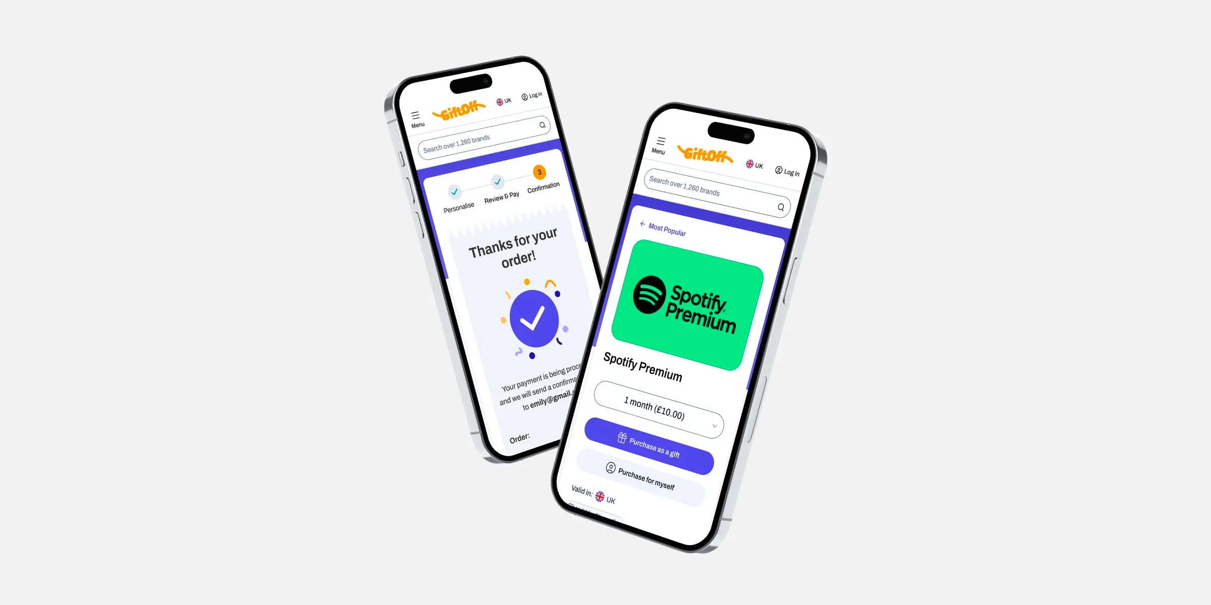
Challenge
Balancing consistency with flexibility to ensure that core components and principles remain unified across brands while allowing enough adaptability for each brand’s unique identity.
Opportunity
- There were no shared components between brands despite most components having shared functionality.
- Delivery took 20 days from design to production.
- Frequent rework caused by inconsistent UI patterns.
- High dependency on designers for pixel-perfect handoffs, slowing development.
- Duplicate QA effort for similar features on both platforms.
Discovery process
I conducted stakeholder interviews with technology director (product owner), UX designer, developers, and project manager to uncover pain points and priorities.
I performed a detailed UI audit comparing components, styles, and interaction patterns across both brands.
After the development team decided on using React and Tailwind CSS with shadcn/ui components, I began exploring ways to integrate this stack into Figma to support a unified design system.
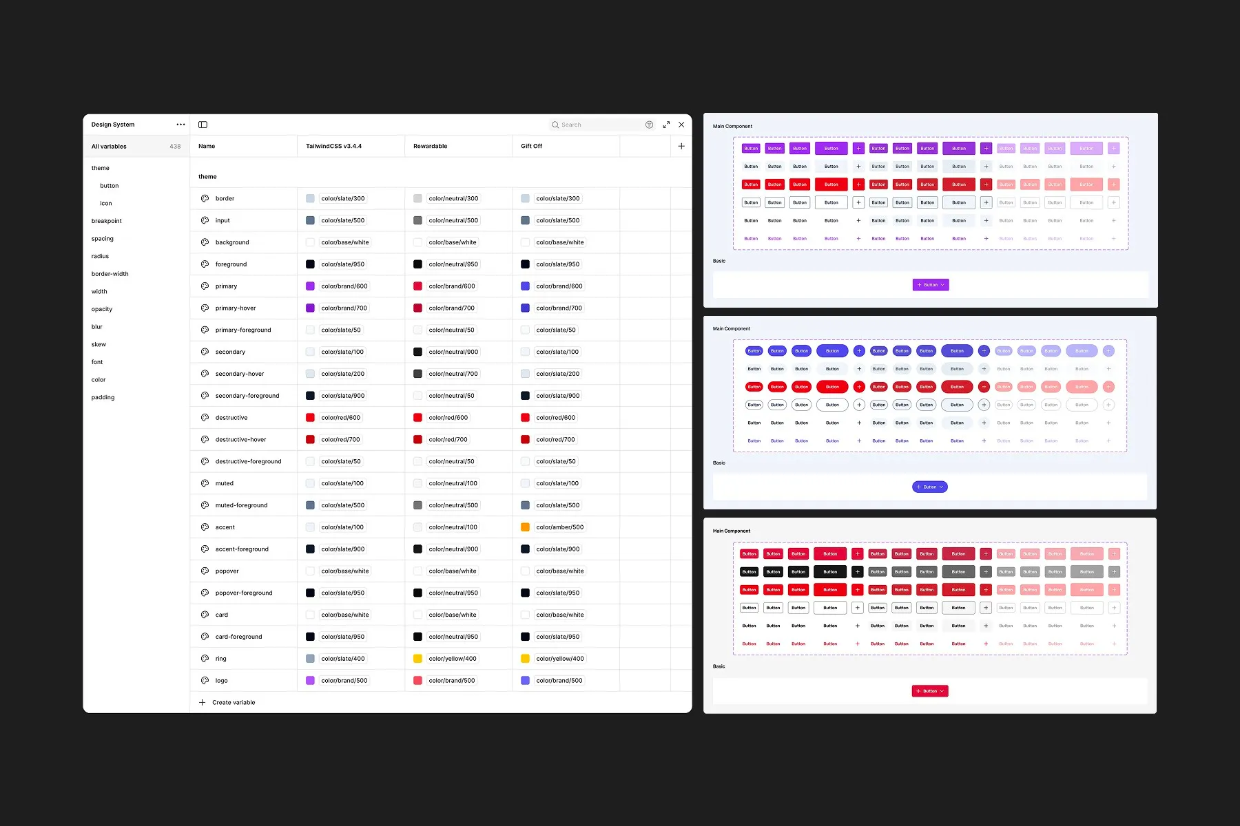
I identified that approximately 80% of components served identical functions but differed visually.
Solution Exploration
-
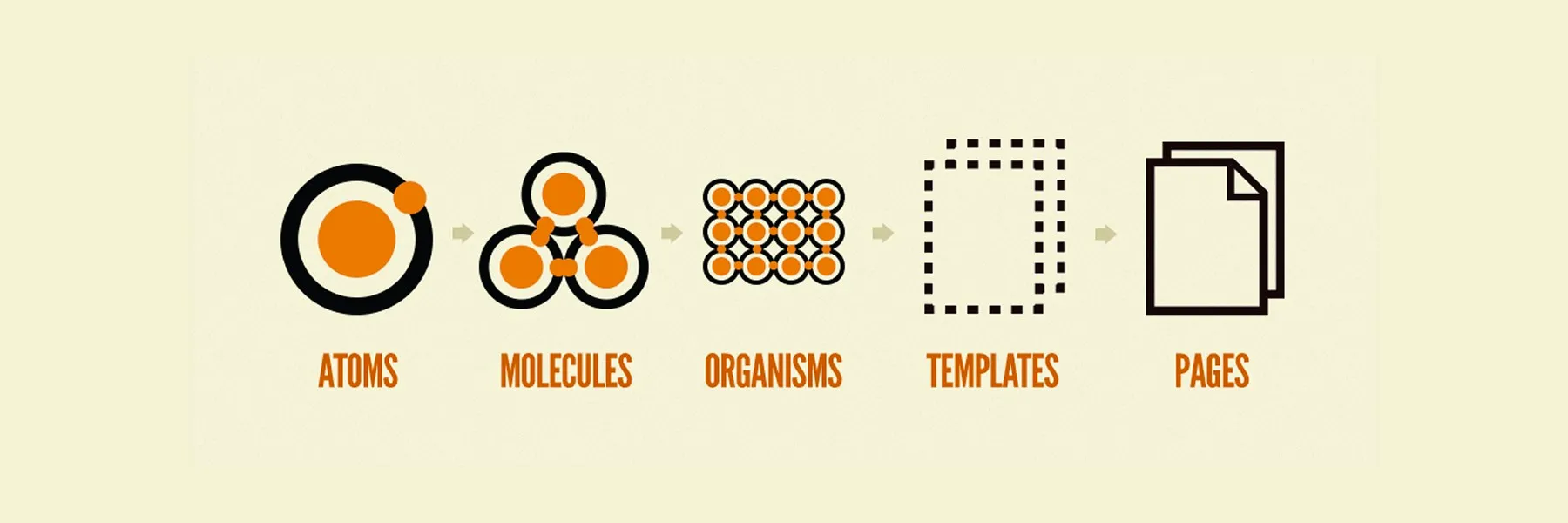
Option A, one Figma file for Atoms, Molecules, and Organisms with a second layer per brand for Templates
-
Option B, one Figma file for Atoms and Molecules with a second layer per brand for Organisms
Decision Framework
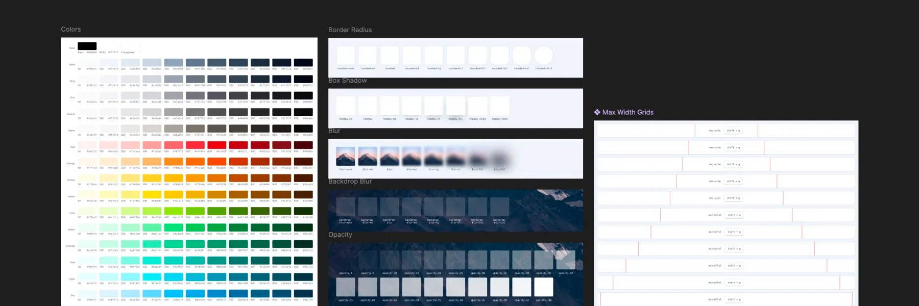
After testing both options, we aligned on the approach that gave us the best balance of flexibility and maintainability.
Implementation
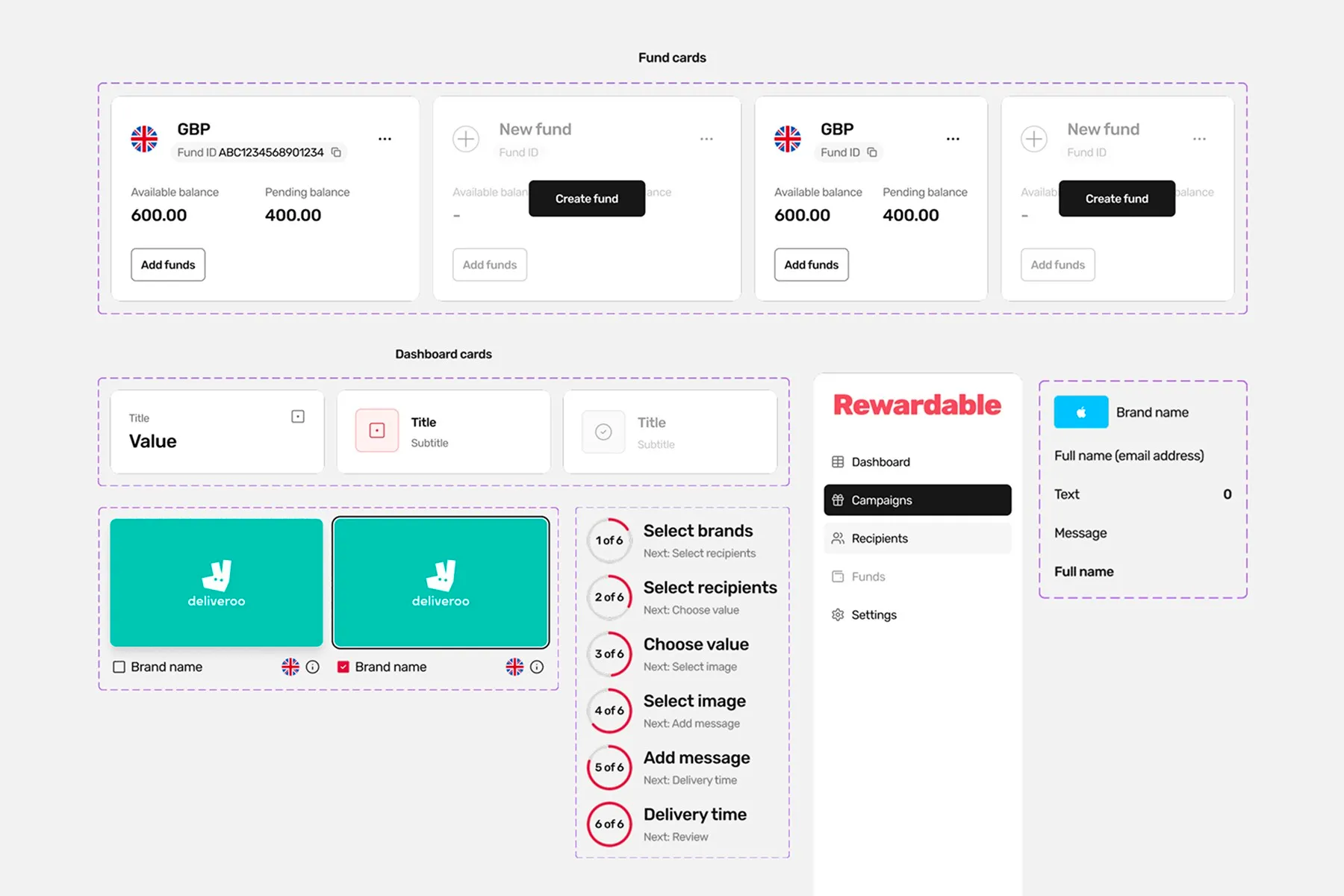
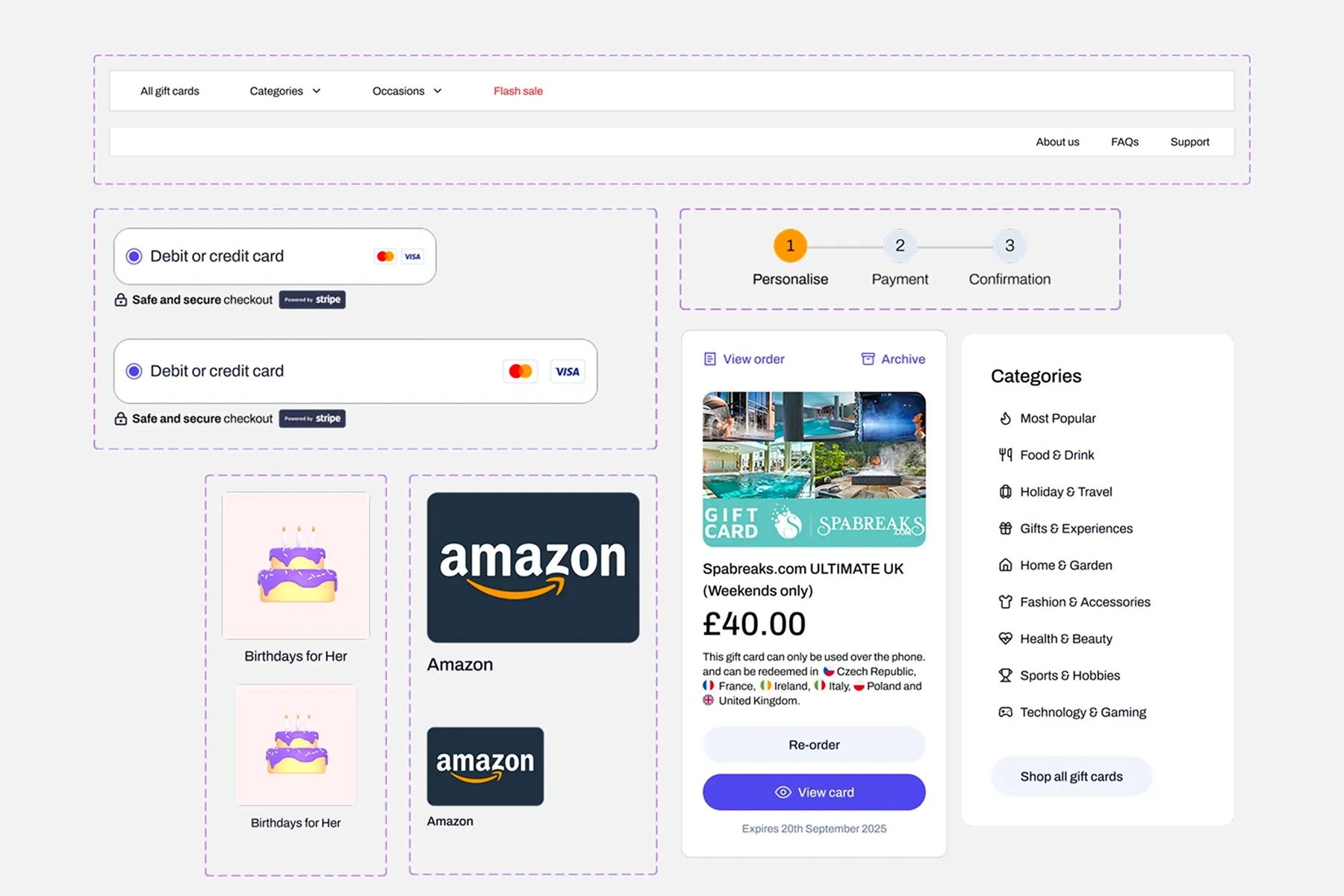
The transition from decision to execution was smooth because implementation had already started during testing.
Shipment
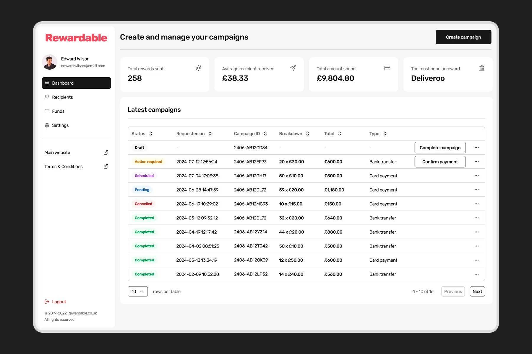
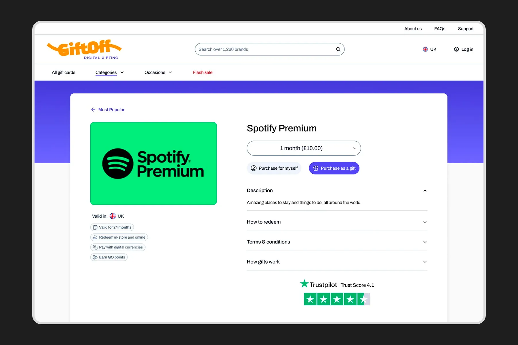
To improve design fidelity, I used Figma AI to create realistic UX copy rather than placeholder text, which helped provide clearer context for stakeholders and developers.
For more detailed and refined UX copy, I also utilised ChatGPT, enabling me to draft user-focused content efficiently.
I also leveraged Figma’s visual search feature to quickly locate matching components within the design system, ensuring consistency and reducing search time.
Additionally, I applied the batch rename layers function to keep files well organised and maintainable while building Templates and Pages, making it easier for the team to navigate and collaborate.
Outcome
A major outcome of the project was that it took half the time to ship similar features across brands compared to before the design system was implemented, improving rollout speed by 50%.