DFS
UX Audit for Workforce Allocation
- Role
- Senior Product Designer
- Year
- 2021
- Location
- United Kingdom
- Duration
- 6 weeks
- Contribution
- Product Design, Design Strategy
Challenge
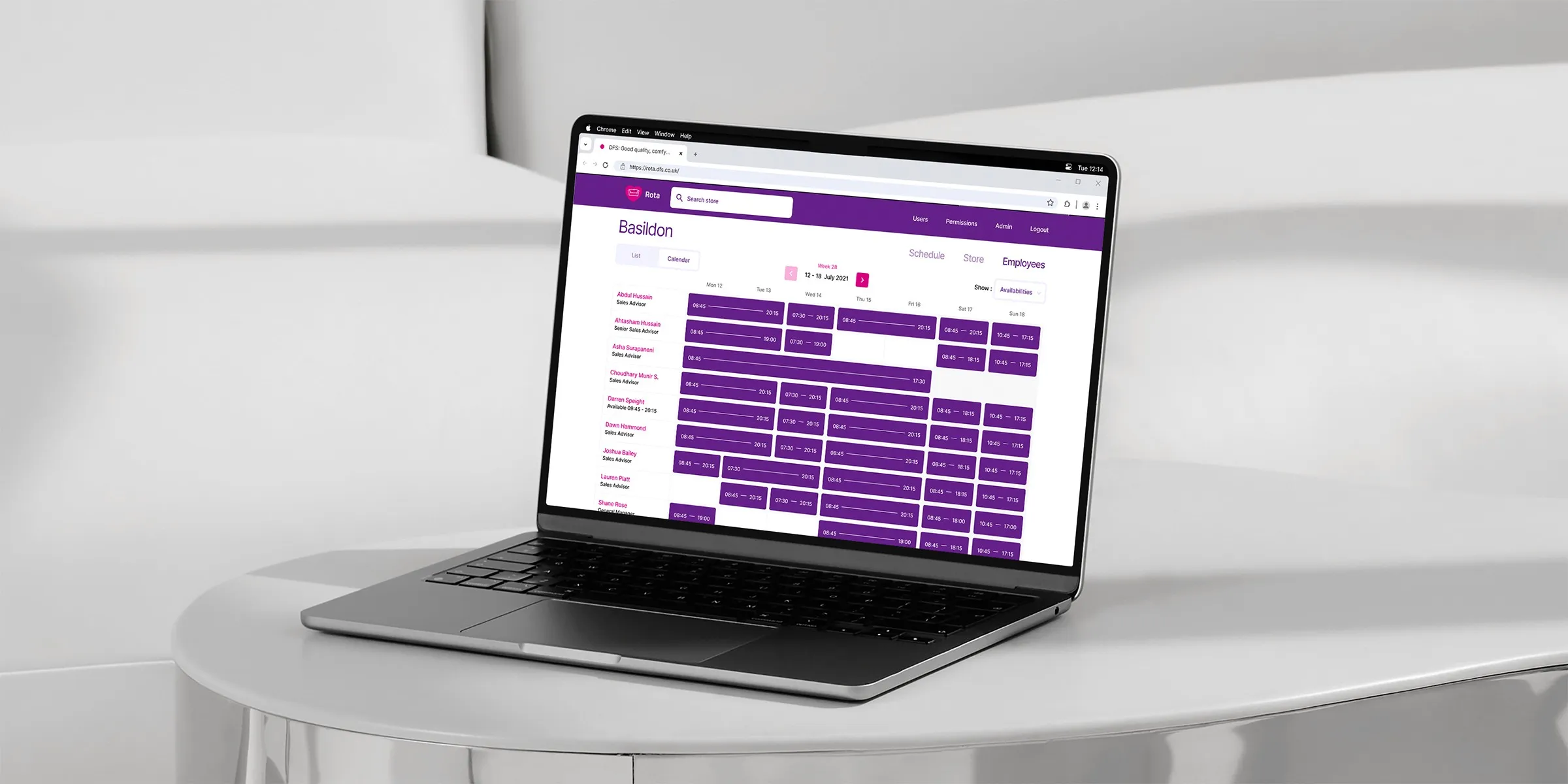
DFS, the UK’s leading furniture retailer, relied on a workforce allocation platform to manage delivery teams, schedules and capacity across its nationwide network. However, the product team had no dedicated designer and design decisions were largely influenced by technical constraints rather than user needs. Over time, this led to inconsistent interfaces, reduced usability and operational inefficiencies that affected day-to-day performance.
Opportunity
- Identify usability issues and friction within key workflows such as delivery assignment, capacity tracking and team scheduling.
- Improve visibility, consistency and clarity across the interface to support faster and more accurate decision-making.
- Create a design foundation that aligned with the operational goals and enabled future scalability.
- Support the development team with actionable design recommendations that could be implemented incrementally.
Discovery Process
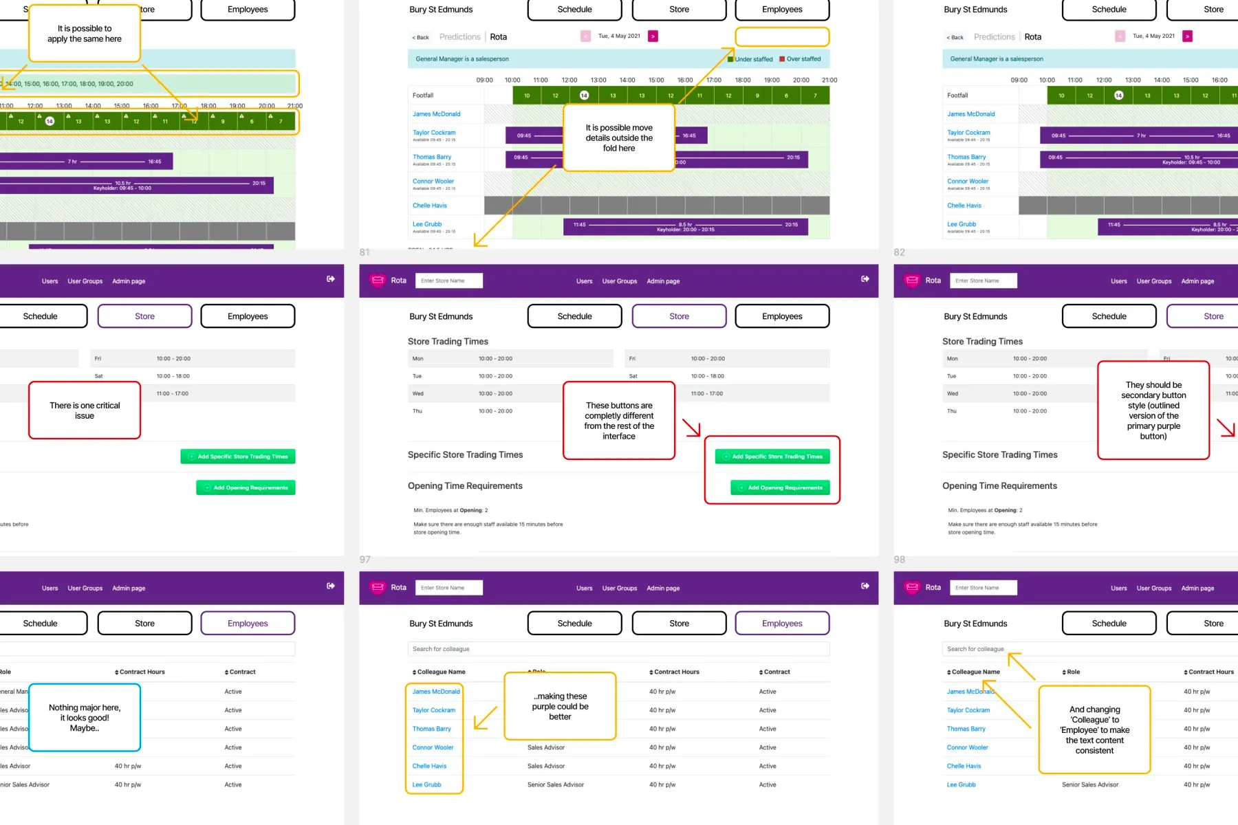
I began by conducting a UX audit of the existing platform, reviewing its core task flows against usability heuristics and real-world user scenarios. Through this analysis, I identified critical pain points including unclear navigation, inconsistent interface patterns and a lack of visibility into team capacity and delivery progress.
Each finding was mapped to specific business outcomes such as time efficiency, accuracy and communication between scheduling teams. The insights were shared with stakeholders to align priorities and define next steps for design improvements.
Solution Exploration
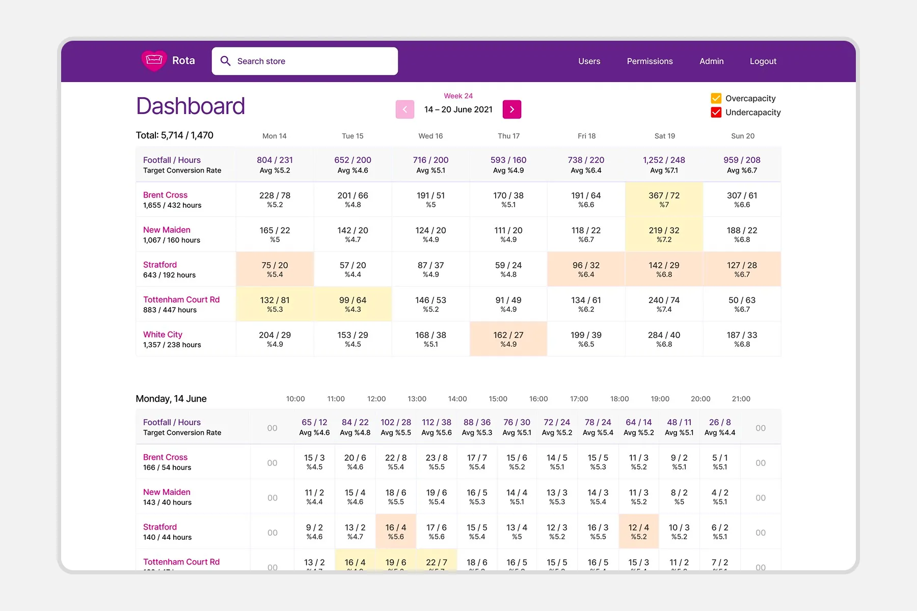
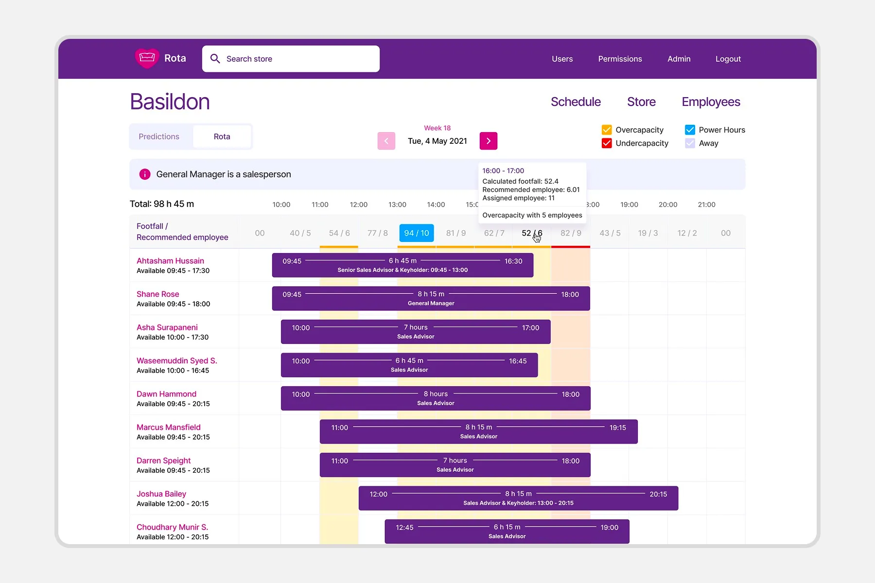
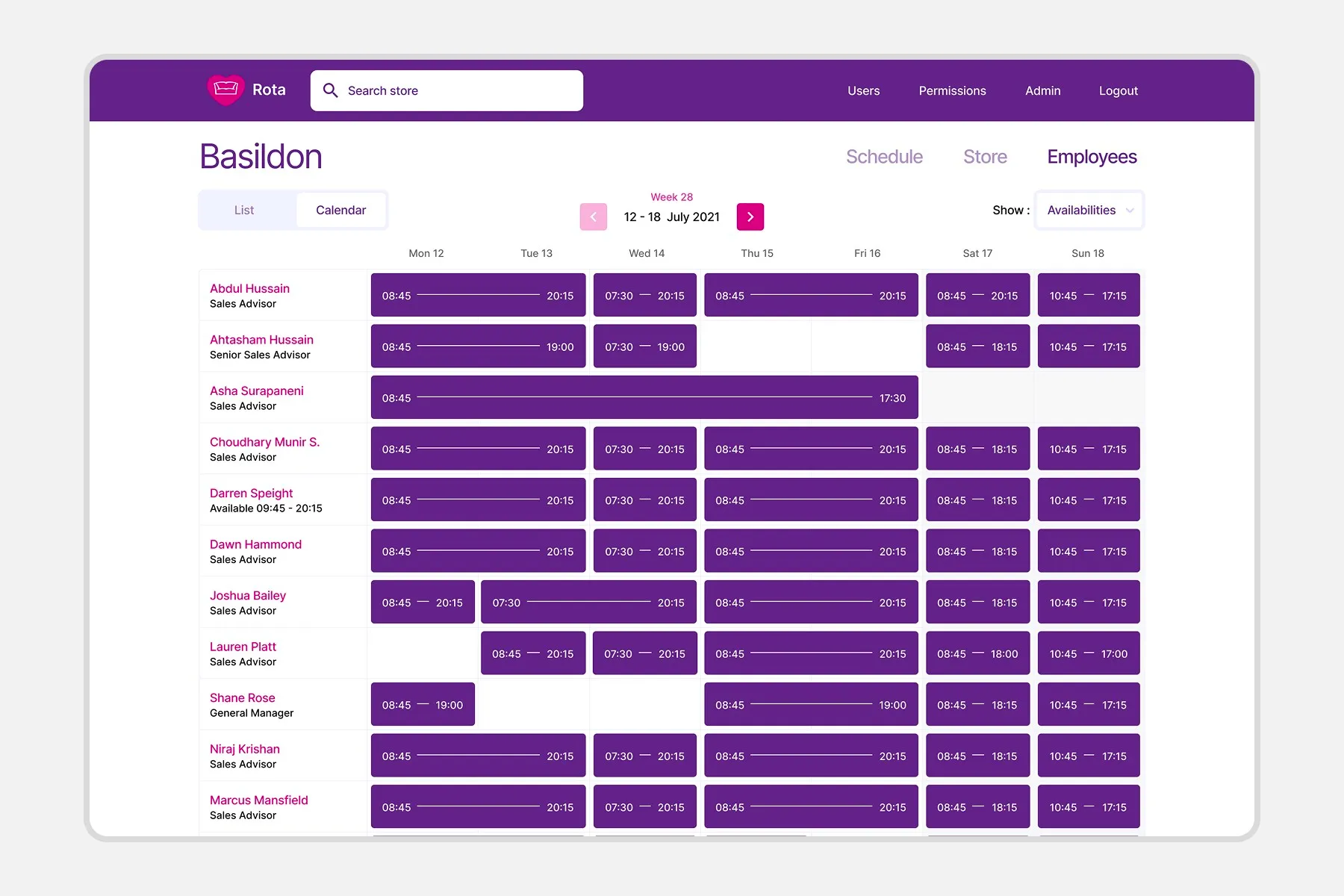
Based on the audit, I produced detailed recommendations supported by high-fidelity mockups and interactive prototypes. These visualised how improved layouts, clearer hierarchy and streamlined workflows could enhance usability and operational visibility.
I also introduced structural improvements to information architecture and interaction patterns to create a consistent, scalable foundation that the development team could adopt quickly without disrupting live operations.
Implementation
The audit findings were presented alongside a prioritised action plan for design and development teams. I collaborated with stakeholders to translate these recommendations into a phased roadmap, ensuring each update delivered measurable improvements to user experience and system performance.
Outcome
The revised designs improved interface clarity and operational efficiency across the workforce allocation process.